A New Look for UW PM
The old UW PM can’t come to the phone right now, ’cause we’re rebranding!
At UW PM, we aim to provide early exposure and training of product management skills. This includes how to deal with change. As of today, UW PM has a new look that we believe better represents our current identity. Hear more about the redesign process from the mastermind himself, our VP of Design, Daniel Leung.

Why make a change from the existing logo?
DL: This change was really prompted because the old logo was old, outdated, and did not reflect the new, modern, innovative nature that is UW PM! We decided to change the logo because the UW PM team has grown a lot in the last couple of terms. From our team of about 11 students in Spring 2021 to now nearly double that, the UW PM community is growing and changing rapidly. Not only the team, but the field of product management is also proving itself to be an essential and growing department for many businesses. What better way to represent this positive change and re-establish the UW PM brand with a brand-new logo that really goes to capture the essence of the product management community at UW and beyond!
What was your inspiration behind the new design?
DL: A large part of the design was inspired by the old logo interestingly enough! Yes, although it is old and outdated, there are a lot of great elements behind it that myself and many others love. The hexagons and salmon pinkish colour really represent the identity of UW PM and date back quite a bit, meaning people are familiar with the design and the UW PM brand. I think the hexagons and colouring of the UW PM brand are incredibly unique and attractive; I don’t know many other brands that use this colour! As such, these formed the foundation for the new logo. From there, it was really playing around with symbols, placement, representation, and understanding how this logo would represent UW PM and the UW product community.
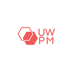
Why hexagons?
DL: I love the hexagons that UW PM represents themselves with because I think it is a great symbol for the field of product management. The idea that being a great product manager means you are multi-talented is really displayed with the use of this multi-sided shape. Great product managers may have to be technically inclined. They may have to work very closely with users and customers. They may have to be design-oriented and be able to apply design thinking processes to wireframe solutions. They may need data analytics skills to justify decisions that heavily influence a feature or business, and the list goes on and on. As such, I think it is important to keep the hexagons in the new logo as it represents the diverse set of skills that product managers bring to any team.
On a similar note, product managers come from all different backgrounds. Product managers are scientists, artists, entrepreneurs, engineers, mathematicians, designers, developers, researchers, and the list continues. Not only do hexagons represent the many skills that are needed to be a great product manager, but the multi-sided shape represents the diversity of backgrounds of product managers and as such, this symbolism was kept in the new design!
Overlapping hexagons is a new element added to the design compared to the old logo, and this was done because it emphasizes the nature of product management. I like to see the new logo almost like a Venn diagram. Product management as a role is really a blend of a variety of disciplines to connect the worlds of technology and business. The new design represents exactly this idea; that product management is the middle ground between tech and business, the space where both are brought together to co-exist.
The other part is that it also resembles that of a chain or link. UW PM’s mission is “To foster the product management community at the University of Waterloo”, and by linking the hexagons together, it really goes to represent this sense of community and interconnectedness at UW; how the mission is to connect students with other passionate students along with providing the skills and tools needed to become great product managers.
Were there any challenges during this project?
DL: Most definitely! One challenge faced was designing with this hexagon shape! Although it is a great shape to symbolize the nature of product management, it is not always the most robust shape to align side by side with other hexagons or other shapes. It was challenging to find ways to use it in a simple but effective manner without overwhelming the brand or making it too hard on the eyes.
The other challenge I found was with the colour! Although it is a beautifully unique colour, it is difficult to pair with other colours other than black and white. Because of this, the logo’s colour identity has not been changed because white really compliments the logo the best. This limitation really isn’t a negative at all because it makes the logo stand out in a very straightforward and natural manner. I am happy that these colours were selected because I think they look great together and really go to emphasize a part of the UW PM community that many are already familiar with.
What message do you want to convey from this rebranding?
DL: The message I want to convey from this rebrand is that I hope it encourages students who are interested or even remotely interested in product management to explore it as a potential career path! Regardless of your program, technical or non-technical skills, I think it is super cool that product management enables people of all backgrounds to pursue it. Even if you find that product management isn’t for you, it may teach you about things that you do enjoy! In general, I hope this rebrand helps bring the product community at UW closer together and that it can help students who are searching for those PM jobs and internships to learn more about what knowledge and skillset are needed through UW PM’s initiatives and events.
What do you hope this logo will bring to UW PM?
DL: For UW PM, I hope the new logo inspires the team to innovate and embrace change. I hope this new logo enables the team to feel a sense of belonging and a sense of community because the UW PM team is an incredibly talented group of passionate students that I am super happy to be a part of. This new logo is a representation of the team’s diversity, hard work, and commitment to the mission of fostering the UW product management community, and I am confident that the team will continue to grow, innovate, and help future product managers!
We are very excited to start this new chapter for our team and hope you are too. Look forward to the UW PM you are familiar with but even better and improved.
written by Chery Susanto